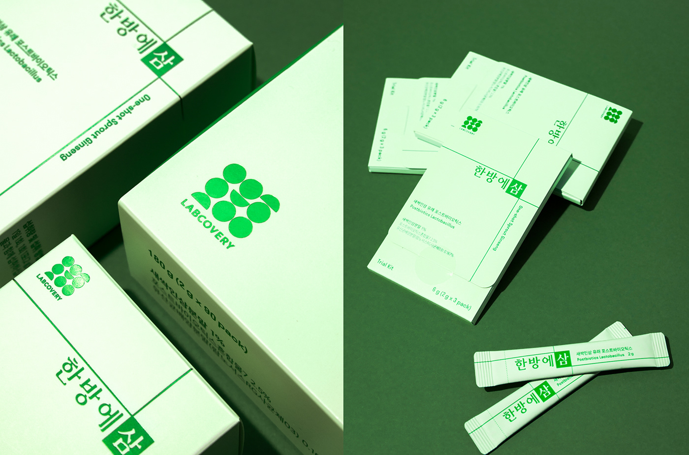
hanbangesam


Hanbangesam

FROTN KIT developed the brand identity, master graphic, and package design of “Hanbangesam”, the probiotics product of “Labcovery” at “Rokya”. As the graphic motif, neat green line effect was used and emphasized to represent the ingredient, ginseng sprout and to express its rapid absorption inside the human body.


Client: Rokya
Agency: FRONT KIT
Creative Direction: Min Ah Hong
Art Direction: Yun Woo Shin
Design: Jung In Lee, Hyeok Kim
Photo: Ga Bin Kim


Check out more work on


hanbangesam
Published:

Project Made For

hanbangesam

FROTN KIT developed the brand identity, master graphic, and package design of “Hanbangesam”, the probiotics product of "Labcovery" at "Rokya". As Read More

Published: